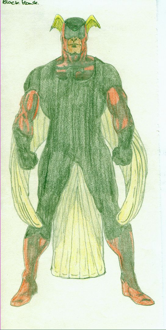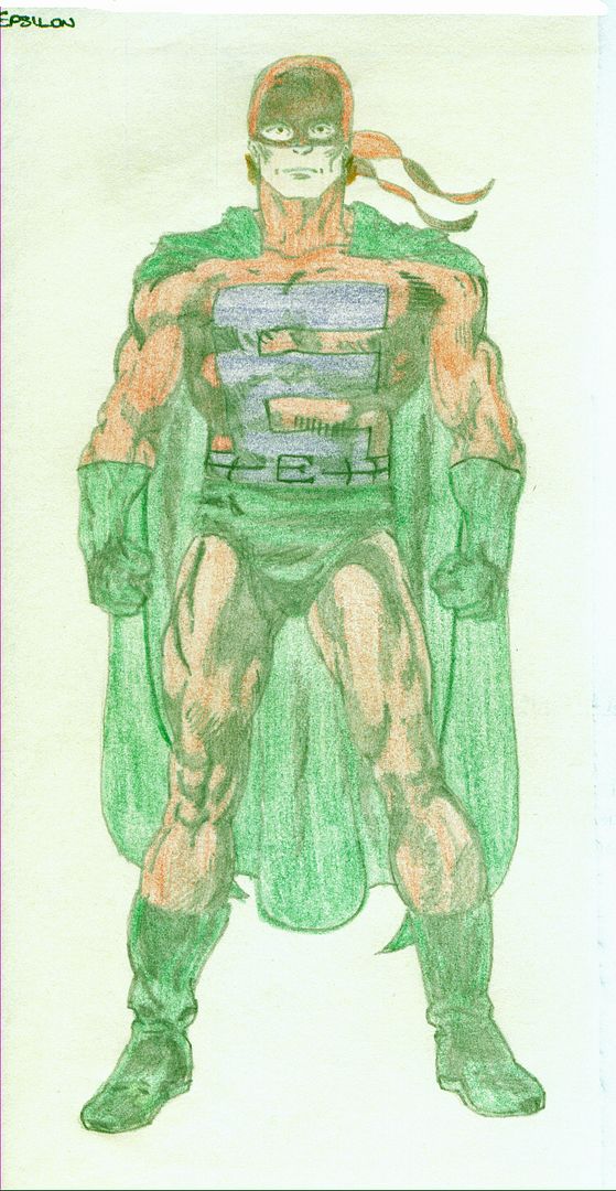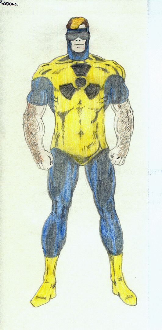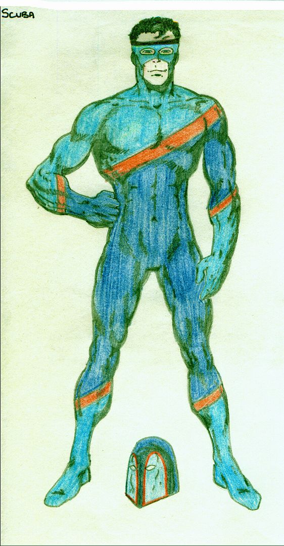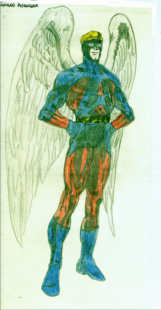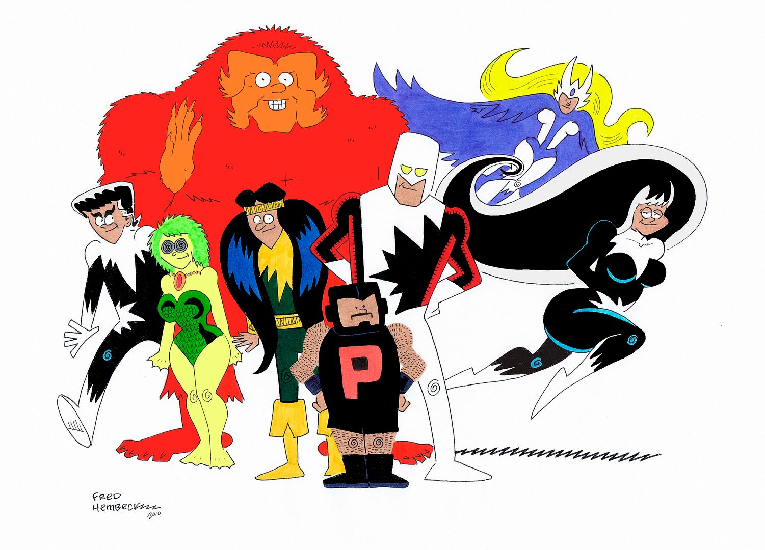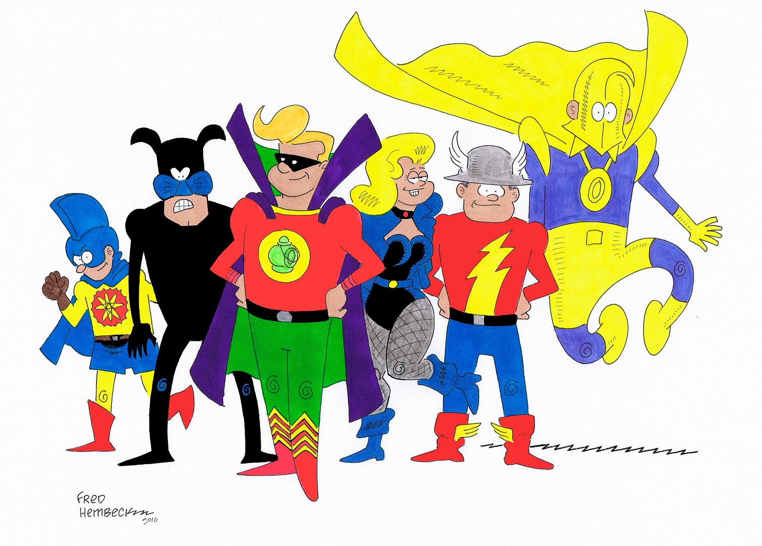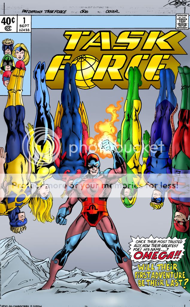
Now, since I doubtless have some of these colors wrong, I need you to tell me where to correct so I can finish this for you. I went by your drawrings posted here, but some of those colors were hard to duplicate plus, the details on some of them are different. So:
RADON - His chest symbol and his goggles looks black on your version. Do they need to be changed to black? Also, you gave him short sleeves; I can add those if you like. I did add the top part of his symbol, which was missing. Hair color OK?
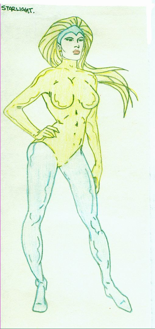
STARLIGHT - Hair need to be lighter?
BLACKHAWK - Great name. I hope he's Indian; there's not enough good Indian characters around. In your version all of the things I have in blue (minus the goggles) are black. Do I need to change this? Castrillo obviously didn't draw those parts as if they were black so maybe you instructed him to change this when he drew it. Or do I just need another shade of blue?
MR. SPEED - Should his eyepieces look like I have them looking?
SOLAR - Right color for the coils? Do they need to be more gold? Hair color OK?
EPSILON - Hair color?
OMEGA - I figure I've got these colors completely wrong. I took them off of you drawring but that doesn't necessarily mean anything. Also his belt is a dark color on yours with a light angular shape around the symbol but he didn't draw it that way. I can fix it to look more like what you have if you desire. But lemme know about his overall colors.
Also whatever other mistakes anyone sees.
PS: Also tried the logo with it running off the page as drawn. Didn't like it. Changed it. The computer, I've found, allows the colorist to become drunk with power.
PPS: Don't say I never gave you anything!


