Mike Ploog is one of the best artists Marvel ever had and one of the least well utilised IMO.
Not sure they had the option to -- he didn't like drawing superheroes from what I can see, and went to work for Hollywood starting with Ralph Bakshi's WIZARDS animated film (where artists make a lot more money for a lot less work, so you can hardly blame him) in the mid-70s.
Whenever he did offer his services to Marvel, they had him doing sword & sorcery (Kull), horror (Man-Thing, Werewolf by Night, Frankenstein, Ghost Rider), and a Planet of the Apes story. So all things considered, I would think you'd love how they utilized him!
I tried drawing sword n' sorcery two or three years ago. I sucked, but at least I learned from it.
I don't think you sucked, you're on the right track. Hopefully you won't mind, but I have a couple easy ways you can improve your drawing that don't require all kinds of technical skills.
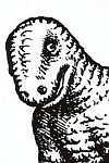
The easiest thing to do is watch your line weights and outline your major figures and shapes. A brush is the best, but you can just use thicker pens or even a Sharpie to do some basic outlines that help separate your planes and figures from each other. Here's your drawing with some thicker outlines added -- forgive the crudeness, this was done quickly to make the point.
Another easy thing is to just add some blacks to frame it up and remove extraneous visual "noise" from the drawing --
And if you want to get slightly more into it, make some tweaks to the composition -- there's some dead space in the drawing. I would have cropped it where the red line is, as there's no real information the viewer needs below it. There's also some dead space on the right of the dragon's torso, so I would have twisted its body the way you see below to fill up some of that space. Anytime you lay out a drawing and think, "Oh great, now I have to fill in this area with a bunch of tedious texture lines," that's your sign to fill it up with something else instead.
I think you should have referenced the human and snake anatomy a bit more too, just for the sake of authenticity. It doesn't have to be realistic or a copy of a photo, you're just looking for those little detail and touches that make it seem more believable. I also like to reference other comic book artists -- not to copy their drawing, but to look at the visual shorthands they use to create texture. How can you create a believable scale texture on the snake without having to draw every scale? Well, look at how other guys figured it out. Alex Raymond, Jack Kirby, whoever -- all the best line artists create a visual shorthand to make drawing both easier and more clear.
I would have also adjusted the hero's left leg so he looks more stable and powerful; there's a reason Kirby always had his figures' legs spread so far apart -- it gives the characters leverage and a strong base, which our minds know is a powerful position for our bodies to be in.
Finally, I would have added way more blacks to the drawing in a way that "frames" the two central figures. It leads the viewers' eyes to those characters by reducing the information around them, it looks more dramatic, and best of all -- it's easy. There's less to draw and render! Black space is a line artist's best friend.
Man-Wolf is one of those nice Bronze Age runs that really needs to be Masterworked.
Some of those panels have me wondering about it now, that's for sure! I have much of David Anthony Kraft's "Defenders" from that period. The Man-Wolf story is where Defenders villain Arisen Tyrk came from. Or I should say "villains," since he got kind of discombobulated in his passage through the dimensions.
_________________ The kingdom of heaven is like a merchant seeking fine pearls who, when he found an especially costly one, sold everything he had to buy it.
Rewatched Fire and Ice on youtube. This is the first time I have watched this movie since I rented it as a kid from the video store. As I kid I was unimpressed with the rotoscoping and a little off put by the adult theme and costumes. But, viewing it now I was very impressed. They were very ahead of their times with this movie. Motion capture is the new rotoscoping. Painted backgrounds vs. digital 3d landscapes.
Never seen "Fire and Ice," but I do have the 1970s "Lord of the Rings." Some of the rotoscoped shots are effective, in a way. The ultra-realistic motion looks quite unreal in the context of an animated film. Sometimes the effect works, and sometimes it doesn't.
Incidentally, rotoscoping got a lot of attention in the 1970s, but it was originally patented under that name by Max Fleischer back in the 1910s. It's 100 years old! WAY ahead of its time when you compare it to today's motion capture.
_________________ The kingdom of heaven is like a merchant seeking fine pearls who, when he found an especially costly one, sold everything he had to buy it.
Rewatched Fire and Ice on youtube. This is the first time I have watched this movie since I rented it as a kid from the video store. As I kid I was unimpressed with the rotoscoping and a little off put by the adult theme and costumes. But, viewing it now I was very impressed. They were very ahead of their times with this movie. Motion capture is the new rotoscoping. Painted backgrounds vs. digital 3d landscapes.
I saw it for the first time a few years ago. Personally, I LOVE rotoscoped animation and since MOTU was based heavily on Frazetta's aesthetic, the whole look and feel provided a big blast of nostalgia despite never seeing it before.
And holy schnikes, how awesome is Darkwolf? He's like if Conan and Batman had a baby... and that baby was ALL MAN.
(This one isn't by Frazetta, but Horley does an awesome impression.)
Users browsing this forum: Amazon [Bot] and 0 guests
You cannot post new topics in this forum You cannot reply to topics in this forum You cannot edit your posts in this forum You cannot delete your posts in this forum You cannot post attachments in this forum