View unanswered posts | View active topics
| Author |
Message |
|
Ian Sokoliwski
|
Post subject: Avengers for Gerry - Step-by-Step  Posted: Posted: Mon May 21, 2007 11:57 am |
|
 |
|
King of Goth
|
| Joined: | 09 Sep 2004 |
| Posts: | 29332 |
| Location: | The Sprawl |
| Bannings: | I'm judging you. |
|
I'm colouring another Paul Smith piece for Gerry Turnbull, so I'm gonna do another step-by-step guide to the colouring process. This one will be dealing with how to work with characters that have the same colours who are overlapping each other and who also are vastly different sizes. Here is the original uncoloured piece - the Avengers! 
_________________
Go take a look at IANTHECOMICARTIST.COM - you know you want to!
|
|
| Top |
|
 |
|
Ian Sokoliwski
|
Post subject: Avengers for Gerry - Step-by-Step Posted: Mon May 21, 2007 12:12 pm |
|
|
|
King of Goth
|
| Joined: | 09 Sep 2004 |
| Posts: | 29332 |
| Location: | The Sprawl |
| Bannings: | I'm judging you. |
|
Here is the page after laying down the basic flat colours. There are several ideas I'm going to be playing with here, and I'd like to briefly mention them right now. 1) the colour red: There are four characters who all have red featured prominently, and they are all on different planes. Each character has to stand out from the others, so I have to think about how I want to make each shade of red different from all the others. The easiest way to do this is by making the character furthest in the background (Giant-Man) the lightest and least saturated, while darkening and saturating the other characters as they get closer to the viewer. In this case, however, I also decided to further tweak the Wasp's colours by shifting it slightly to Magenta. This will pull her even further forward from Captain America without making her too dark. 2) scale: Giant-Man is huge. The Wasp is not. I want to incorporate that into the colouring, to reinforce the fact that Iron Man and Thor are (more or less) the same size as Captain America. 3) the translucent nature of the Wasp's wings: You will notice that the Wasp's wings are not flatted. That is only partially true. In fact, I have made a separate selection just for the wings, one that is saved on a separate channel. This way, I will paint everything behind them normally, then use that channel to select them and fade that colouring out a bit, creating that translucent effect. 4) cool background/warm foreground: A very simple thing, and one that you have to deal with all the time in colouring. The background sky will be blue (cool), while the foreground rocks will be brown (warm). This sets up the two basic planes that all other modeling/colours will work from. Also, the blues will be lighter and less saturated, and the browns will be darker and more saturated, again enhancing the notion of space in the illustration. 5) light source: If you look at the shadows on the ground and on the characters, the major light source appears to be coming from above and slightly behind the characters. This will make them slightly back-lit (a good thing to do to create a sense of mass and dimension in the characters). To further get across the idea of dimension, I will be putting in a less-intense light source from slightly below and in front of the characters, presumably reflected from the rocks and other stuff from just below the viewer. 
_________________
Go take a look at IANTHECOMICARTIST.COM - you know you want to!
|
|
| Top |
|
|
|
Ian Sokoliwski
|
Post subject: Avengers for Gerry - Step-by-Step Posted: Mon May 21, 2007 12:23 pm |
|
|
|
King of Goth
|
| Joined: | 09 Sep 2004 |
| Posts: | 29332 |
| Location: | The Sprawl |
| Bannings: | I'm judging you. |
|
The blue background. I want this to be extremely light. Without any really flashy modeling to distract the eye from the action. So, I went with the very pale blue/cyan, starting with a gradient of lighter colour from the top. Then, using the paintbrush tool, I painted in a bit of light cloud texture, just suggesting depth without going over the top with it. 
_________________
Go take a look at IANTHECOMICARTIST.COM - you know you want to!
|
|
| Top |
|
|
|
Ian Sokoliwski
|
Post subject: Avengers for Gerry - Step-by-Step Posted: Mon May 21, 2007 12:26 pm |
|
|
|
King of Goth
|
| Joined: | 09 Sep 2004 |
| Posts: | 29332 |
| Location: | The Sprawl |
| Bannings: | I'm judging you. |
|
|
| Top |
|
|
|
Ian Sokoliwski
|
Post subject: Avengers for Gerry - Step-by-Step Posted: Mon May 21, 2007 12:31 pm |
|
|
|
King of Goth
|
| Joined: | 09 Sep 2004 |
| Posts: | 29332 |
| Location: | The Sprawl |
| Bannings: | I'm judging you. |
|
|
| Top |
|
|
|
Ian Sokoliwski
|
Post subject: Avengers for Gerry - Step-by-Step Posted: Mon May 21, 2007 12:43 pm |
|
|
|
King of Goth
|
| Joined: | 09 Sep 2004 |
| Posts: | 29332 |
| Location: | The Sprawl |
| Bannings: | I'm judging you. |
|
This is the finished background. There isn't much left of the initial 'cloudy' effect - it was just put in to give me an idea of how to create the rocks. Don't just use the cloud filter for anything like this, however. It flattens out whatever you are using it for. It is good to use when you want to create funky patterns, as long as you then paint over it to bring out the details in the lineart (both light and shadow). It can also be spotted as an easy Photoshop cheat if used by itself. And you want to stay away from anything that identifies something as being a Photoshop filter - that kind of work leads to the backlash against Photochopping  Filters are fine to use as long as they are part of the painting process, not the finished piece. IMHO of course  
_________________
Go take a look at IANTHECOMICARTIST.COM - you know you want to!
|
|
| Top |
|
|
|
Ian Sokoliwski
|
Post subject: Avengers for Gerry - Step-by-Step Posted: Mon May 21, 2007 1:01 pm |
|
|
|
King of Goth
|
| Joined: | 09 Sep 2004 |
| Posts: | 29332 |
| Location: | The Sprawl |
| Bannings: | I'm judging you. |
|
Giant-Man. Pale, pale, pale! The further back in the picture I can make Giant-Man, the bigger he will appear! Very simple modeling (as you wouldn't see a whole lot of tight detail with him being that far away), with the blues going to white ... I was even tempted to make large amounts of the reds go to white, but held off as that might make him a bit too shiny. I'm thinking about doing a colour-hold on the lineart on him - making his black lines a very dark grey instead, to further separate him and increase his height, letting Iron Man and Thor pop out even further. I still haven't decided on that one just yet. 
_________________
Go take a look at IANTHECOMICARTIST.COM - you know you want to!
|
|
| Top |
|
|
|
Ian Sokoliwski
|
Post subject: Avengers for Gerry - Step-by-Step Posted: Mon May 21, 2007 1:19 pm |
|
|
|
King of Goth
|
| Joined: | 09 Sep 2004 |
| Posts: | 29332 |
| Location: | The Sprawl |
| Bannings: | I'm judging you. |
|
Thor, Iron Man, and a bit more on Giant Man (hyphenated or not, you choose  ). I decided that Iron Man, because of the way he is flying, should mostly be in shadow - what with the main light source being from above. So, the upper parts of his armour (including the entirety of his hand), anything that is facing up, is very light yellow/white. There is a minor amount of secondary modeling - that is, modeling from a second light source - on his underside, mostly to just pick out some details, like the roundness of his unibeam. Very high contrast, to get across the notion of metal. The thing to keep in mind with Thor is that his cape works best as very heavy cloth. This means, it is really effective to use a minimum of modeling on it, and avoid going to small white highlights - a lot of modeling and using white highlights will convey something being shiny, not a heavy fabric. So, I'm using a fairly well-saturated red on him. Oh, and, after modeling Thor, I decided to make Giant Man's reds even paler. 
_________________
Go take a look at IANTHECOMICARTIST.COM - you know you want to!
|
|
| Top |
|
|
|
Ian Sokoliwski
|
Post subject: Avengers for Gerry - Step-by-Step Posted: Mon May 21, 2007 1:52 pm |
|
|
|
King of Goth
|
| Joined: | 09 Sep 2004 |
| Posts: | 29332 |
| Location: | The Sprawl |
| Bannings: | I'm judging you. |
|
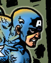
Captain America...and Giant Man. CONTRAST, CONTRAST, CONTRAST!! I'm using very saturated, rich colours on Cap, and going to white on a lot of the modeling. This strongly brings him into the foreground and enhances the spandex and chain mail look of his outfit. Plus, using white highlights on him and not on Thor further separates the two characters in space. The white highlights are staying almost entirely on the main light source, the one from above/behind. Most of the attention of the figure is then drawn up to his conflict with the Hulk. ...and I faded out Giant Man's blues some more. I'm thinking I'm probably going to have to fade out the background blue sky a bit more as well, so that Mr Pym doesn't entirely fall into the background... 
_________________
Go take a look at IANTHECOMICARTIST.COM - you know you want to!
|
|
| Top |
|
|
|
Ian Sokoliwski
|
Post subject: Avengers for Gerry - Step-by-Step Posted: Mon May 21, 2007 2:04 pm |
|
|
|
King of Goth
|
| Joined: | 09 Sep 2004 |
| Posts: | 29332 |
| Location: | The Sprawl |
| Bannings: | I'm judging you. |
|
The Wasp and the sky. So, yeah. I lightened the sky a bit more. Ah, the Wasp. Okay, to further play around with her reds, I had the light affecting the top of her (the primary light source, if you recall) only brightening the reds rather than creating any bright highlights - similar to what I did on Thor's cape. However, the secondary light source does almost go to white. The fashion plate that she is, I figure that her spandex is more silk-like, and shimmers a bit, reflecting the light around her in odd and unexpected ways. This makes her separate from everyone else and the background even more, without having to resort to just making her reds pink. Now, they only have a slighly more magenta cast to them than on the other characters. And don't worry, I haven't forgotten about making her wings translucent. That will be part of the special effects on this page. 
_________________
Go take a look at IANTHECOMICARTIST.COM - you know you want to!
|
|
| Top |
|
|
|
Ian Sokoliwski
|
Post subject: Avengers for Gerry - Step-by-Step Posted: Mon May 21, 2007 2:35 pm |
|
|
|
King of Goth
|
| Joined: | 09 Sep 2004 |
| Posts: | 29332 |
| Location: | The Sprawl |
| Bannings: | I'm judging you. |
|
The Hulk, the rocks, and a mistake. Okay, right off the bat, I'd like to point out that I had made a mistake when flatting this page - I had made the Hulk's right knee the same colour as the rocks. So, here it is fixed. Also, on the subject of the rocks, I faded them a bit, made them slightly more saturated (slightly more yellow/orange, not quite as neutral), and added in some brighter modeling on the ground around the Hulk's feet, adding a bit more depth to the scene. As to the Hulk. Primary light from above and behind, as with all the other figures, with not a whole lot of secondary lighting - that works better on Cap, and this also makes the texture of the Hulk's skin different from Cap's uniform. The Hulk's tongue. On the previous Defenders piece that I had coloured for Gerry, I had make the Hulk's tongue pink. When it came to flat this page, however, because the tongue is much more prominent, it struck me that I wasn't quite sure what colour it should be (pink or green). And I'd say of all the references I looked at, half had a green tongue, and half had a pink tongue. So, I asked Gerry which he would want. He told me that he normally prefers the green tongue, but that he liked what I did with the pink tongue in the previous picture, to go with pink. Which works for me. I like how it has more contrast, giving even more of a dynamic quality to the Hulk's face. After all, when a character is almost all one colour, any colour differences really jump out, which is a good thing most of the time  
_________________
Go take a look at IANTHECOMICARTIST.COM - you know you want to!
|
|
| Top |
|
|
|
Ian Sokoliwski
|
Post subject: Avengers for Gerry - Step-by-Step Posted: Mon May 21, 2007 3:05 pm |
|
|
|
King of Goth
|
| Joined: | 09 Sep 2004 |
| Posts: | 29332 |
| Location: | The Sprawl |
| Bannings: | I'm judging you. |
|
FX and final touch-ups. Victoria suggested I skew a small amount of the back-lighting on the Hulk to yellow - I like how it turned out This is the final image. The wings are now translucent and colour held to white, along with the signatures, and Giant Man has also been colour held to a dark blue-grey. With the addition of two small glows, the picture is now complete. Now, I just need to wait to see if Gerry wants any changes made 
_________________
Go take a look at IANTHECOMICARTIST.COM - you know you want to!
|
|
| Top |
|
|
|
Gerry
|
Post subject: Avengers for Gerry - Step-by-Step Posted: Mon May 21, 2007 6:37 pm |
|
| Joined: | 09 Jan 2005 |
| Posts: | 21109 |
| Location: | The Village |
|
|
| Top |
|
|
|
vf65
|
Post subject: Avengers for Gerry - Step-by-Step Posted: Mon May 21, 2007 7:11 pm |
|
| Joined: | 29 Dec 2006 |
| Posts: | 430 |
|
|
This may sound weird, as nice as the finished version is, I really dig the "flats" look. Maybe because Paul Smith really captured the classic look and in those days flat was the way. Sharp work as usual Ian.
_________________
Vlad
|
|
| Top |
|
|
|
Ian Sokoliwski
|
Post subject: Avengers for Gerry - Step-by-Step Posted: Tue May 22, 2007 1:44 pm |
|
|
|
King of Goth
|
| Joined: | 09 Sep 2004 |
| Posts: | 29332 |
| Location: | The Sprawl |
| Bannings: | I'm judging you. |
|
Gerry wrote: Ian, how were the winsome Wasp's wings done? Well, as I said, the lineart for the wings was colour held, changed to white. The wings themselves...after I finished painting the image and put all the lines and other effects in, I created another layer above everything else. I then filled in the selection for the wings with white. I then lowered the transparency of the layer, so that the colouring and lineart behind the wings could still be seen - I think it is set to about 50% or so.
_________________
Go take a look at IANTHECOMICARTIST.COM - you know you want to!
|
|
| Top |
|
|
|
Ian Sokoliwski
|
Post subject: Avengers for Gerry - Step-by-Step Posted: Tue May 22, 2007 1:47 pm |
|
|
|
King of Goth
|
| Joined: | 09 Sep 2004 |
| Posts: | 29332 |
| Location: | The Sprawl |
| Bannings: | I'm judging you. |
|
vf65 wrote: This may sound weird, as nice as the finished version is, I really dig the "flats" look. Maybe because Paul Smith really captured the classic look and in those days flat was the way. Sharp work as usual Ian. Oh, I get that, Vlad. Although if I was going to paint it that way, I would have made all the colours much brighter (not using the shadow tones there) with a little bit of cut-film modeling, as that was very common on images of that time. In fact, many covers of the sixties did have a bit of airbrushing-style modeling, but quite often it would end up being kinda muddy due to the quality of paper (even the covers) used at the time.
_________________
Go take a look at IANTHECOMICARTIST.COM - you know you want to!
|
|
| Top |
|
|
|
Gerry
|
Post subject: Avengers for Gerry - Step-by-Step Posted: Tue May 22, 2007 5:14 pm |
|
| Joined: | 09 Jan 2005 |
| Posts: | 21109 |
| Location: | The Village |
|
|
| Top |
|
|
|
vf65
|
Post subject: Avengers for Gerry - Step-by-Step Posted: Tue May 22, 2007 5:55 pm |
|
| Joined: | 29 Dec 2006 |
| Posts: | 430 |
|
Ha, you asked for that one Ian. Time to explain the all about coloring before computers. And don't forget to get into how the colorists didn't technically do the actual coloring. 
_________________
Vlad
|
|
| Top |
|
|
|
Ian Sokoliwski
|
Post subject: Avengers for Gerry - Step-by-Step Posted: Tue May 22, 2007 7:25 pm |
|
|
|
King of Goth
|
| Joined: | 09 Sep 2004 |
| Posts: | 29332 |
| Location: | The Sprawl |
| Bannings: | I'm judging you. |
|
Gerry wrote: what is cut film modelling? Well, basically, cut film modeling doesn't have any gradients or airbrushing at all - just blocks of colour. You still see this a lot in some manga as well as some more 'cartoony' comic books. It comes from how colouring was done back before computers, when you had to actually cut the colour film to get the colours on the page in print. I won't go into the entire process, mostly because I've only heard about it (thankfully, I never had to actually do that)
_________________
Go take a look at IANTHECOMICARTIST.COM - you know you want to!
|
|
| Top |
|
|
|
Ian Sokoliwski
|
Post subject: Avengers for Gerry - Step-by-Step Posted: Tue May 22, 2007 7:30 pm |
|
|
|
King of Goth
|
| Joined: | 09 Sep 2004 |
| Posts: | 29332 |
| Location: | The Sprawl |
| Bannings: | I'm judging you. |
|
|
| Top |
|
|
|
vf65
|
Post subject: Avengers for Gerry - Step-by-Step Posted: Tue May 22, 2007 7:58 pm |
|
| Joined: | 29 Dec 2006 |
| Posts: | 430 |
|
Lucky you. The few professional coloring jobs I did, were done the old fashioned way. Of course, luckily the colorists didn't have to do the color separations themselves.
_________________
Vlad
|
|
| Top |
|
|
|
Stephen Bertrand
|
Post subject: Avengers for Gerry - Step-by-Step Posted: Thu May 24, 2007 12:15 am |
|
| Joined: | 29 Sep 2004 |
| Posts: | 74 |
|
|
What, in a nutshell, is this "color-hold" you talk about. I get what the effect does. But how do you do it?
|
|
| Top |
|
|
  |
Page 1 of 2
|
[ 34 posts ] |
|
View unanswered posts | View active topics
Who is WANline |
Users browsing this forum: No registered users and 1 guest |
|
You cannot post new topics in this forum
You cannot reply to topics in this forum
You cannot edit your posts in this forum
You cannot delete your posts in this forum
You cannot post attachments in this forum
|
|