“IMWAN for all seasons.”


Post new topic Reply to topic  [ 9 posts ] 
Author Message
 Post subject: Ian, I could really use some feedback on this piece.
PostPosted: Fri Sep 19, 2008 3:40 pm 
User avatar
Colourist in Training

Joined: 01 Aug 2007
Posts: 60
Location: Northern parts
Ok, this is a piece I'm doing for free for a client ( I approached him myself, because he was in possession of such a great piece of art) and I've already gotten some great feedback on it on another forum, but I'm not quite satisfied with what I have produced so far.

I can see the improvements, like the better complexion, more colour-accuracy and such. But there seems to be something that's missing in the process... I'm thinking it's the highlights, they don't have the same oomph anymore, and I think they've become slightly malformed in the process.

What do you think, mate?

Here is the current version:
Image

And this is an older version.
Image

_________________
In training.

I've got a jumbled up gallery


Top
  Profile  
 
 Post subject: Ian, I could really use some feedback on this piece.
PostPosted: Sat Sep 20, 2008 10:28 am 
User avatar
King of Goth

Joined: 09 Sep 2004
Posts: 29332
Location: The Sprawl
Bannings: I'm judging you.
Well, okay, sure.

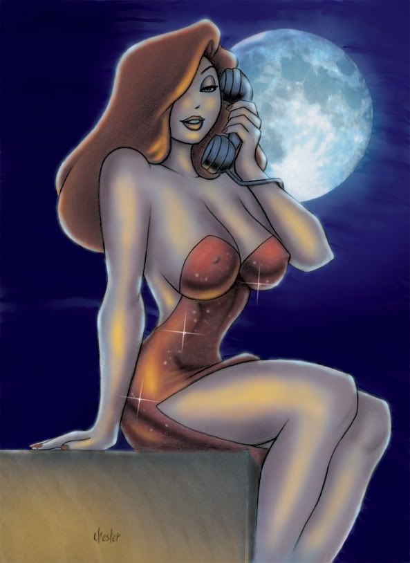
Let's see, I like the transition from cool to warm tones in the flesh - it sets Jessica in the cool night, while opening up a warm foreground, making this picture really jump out.

However, the colour of the yellow highlights is too saturated. It is a darker colour than the flesh tones surrounding it - this makes it look like paint rather than light. Mathematically, if you are painting in CMYK, the value of the Yellow in the highlight should not be higher than the value of the Yellow in the surrounding skin tones.

It's also a little unclear where the yellow light is coming from. On the box that Jessica is sitting on, the light would seem to be coming from below and the (viewer's) left. However, there are yellow highlights on Jessica that indicates the light is coming from above (her right hand, the one on the box), directly from the front (her leg and hip), from directly below (her right breast), and from below and the (viewer's) right (her hair). Now, light could be coming from all these directions, but that would mean that those light sources should be causing multiple reflections on her limbs (except where blocked). So, it winds up being a bit confusing to the viewer.

It looks like you should have three light sources:

1) The moon. Your backlighting is working very nicely already, so there isn't much to comment on here;

2) Below and (viewer's) right. This picks up the great highlight on the bottom of the breasts and her hair. So, a bit more light from this direction should be added on her right leg (the yellow highlight on her left leg from this direction would be washed out by the blue backlight, so you don't need to worry about that) as well as a little bit on the bottom and side of her face. This sidelighting works wonders to convey three-dimensionality in a figure; and

3) Below and (viewer's) left. This would be more or less the primary light source, the one coming from the front - a bit of tweaking, pushing it to the (viewer's) left would make it a touch more dynamic.

Try playing around with those lighting changes on a separate layer and see what you come up with :)

_________________
Go take a look at IANTHECOMICARTIST.COM - you know you want to!


Top
  Profile  
 
 Post subject: Ian, I could really use some feedback on this piece.
PostPosted: Sat Sep 20, 2008 4:06 pm 
User avatar
Colourist in Training

Joined: 01 Aug 2007
Posts: 60
Location: Northern parts
Excellent! :) I think I'll give that a try. I'm not very good with multiple light sources tho, so I'll focus on the primary from the bottom left to begin with.

Here's the original pencils btw, for reference.

Image

EDIT: 'Ere we go. Got inspired by your detailed crits so I gave it a new shot. And I rather like it, except that obviously the face needs more work. :)

What do you think about the light-sources? A bit more accurate..?

Image

_________________
In training.

I've got a jumbled up gallery


Top
  Profile  
 
 Post subject: Ian, I could really use some feedback on this piece.
PostPosted: Sat Sep 20, 2008 11:54 pm 
User avatar
King of Goth

Joined: 09 Sep 2004
Posts: 29332
Location: The Sprawl
Bannings: I'm judging you.
Okay, yeah, that's working a lot better already. Now it looks like there is light falling on her :) You can still remove more of the blue from the highlighted areas, which will warm up the lighting even more, but this is an excellent start!

_________________
Go take a look at IANTHECOMICARTIST.COM - you know you want to!


Top
  Profile  
 
 Post subject: Ian, I could really use some feedback on this piece.
PostPosted: Sat Sep 20, 2008 11:54 pm 
User avatar
King of Goth

Joined: 09 Sep 2004
Posts: 29332
Location: The Sprawl
Bannings: I'm judging you.
Oh, and that 'original pencils' image is just giving me a photobucket error message.

_________________
Go take a look at IANTHECOMICARTIST.COM - you know you want to!


Top
  Profile  
 
 Post subject: Ian, I could really use some feedback on this piece.
PostPosted: Sun Sep 21, 2008 10:00 am 
User avatar
Colourist in Training

Joined: 01 Aug 2007
Posts: 60
Location: Northern parts
Yeah... I noticed that it's giving the error. Not sure why it was deleted, but I'm guessing it's a break in copyright? But I didn't think there was such a problem when the art is at a measly 72 dpi... Could of course be that Photobucket is a bit of a prude, but then the other images would have been deleted as well.

Image

I've been thinking about removing the blue... but the thing is, a part of what made the older versions have a strange skin-tone was that I removed the blue underneath, giving off a strange effect where the skin isn't colour-accurate. I could copy the rendering-layer tho, and try putting it to overlay and playing a bit with the opacity, yeah? Might give some interesting results.

_________________
In training.

I've got a jumbled up gallery


Top
  Profile  
 
 Post subject: Ian, I could really use some feedback on this piece.
PostPosted: Sat Oct 25, 2008 8:36 pm 
User avatar
Colourist in Training

Joined: 01 Aug 2007
Posts: 60
Location: Northern parts
Man... I've tried redoing her face like 7 times now... and I still can't quite get it right.

The thing is, when rendering Jessica, it is just as important what you DON'T render as what you do render. Finding that balance in her face is extremely hard.

What do you think, Ian? What am I missing here, to make it just perfect?

Image

_________________
In training.

I've got a jumbled up gallery


Top
  Profile  
 
 Post subject: Ian, I could really use some feedback on this piece.
PostPosted: Tue Nov 04, 2008 11:32 pm 
User avatar
King of Goth

Joined: 09 Sep 2004
Posts: 29332
Location: The Sprawl
Bannings: I'm judging you.
Hey Predabot :)

The key thing to work on is her nose - if you look at the sample I've included here (don't worry about the colours or anything, I was just trying to do a quick rendering job), you can see that I've brought out the light reflecting on her nose a little bit.

The nose is one of the more important parts of a character's face to work on - generally, the brightest highlight on the entire face will be on the tip of the nose, facing toward the light source. Of course, this also means that nose modeling has the highest contrast - that is, only a small spot on the nose will have that much light on it, so it will also have much more of the mid-tone colouring than other parts of the face (the ratio between the two, that is) to emphasize the fact that it is only a spot on the nose (and a line along the side of the nose, quite often) that is catching that light.

So, it means that a bit of the nose should actually be a little bit brighter than the cheekbones (or at least just as bright) - otherwise, the nose seems to sink back too much.

Again, don't try to match my modeling exactly - I'm only working from the lo-rez image you posted, so my modeling is a bit off. It was really just to show how to work with the colours/lighting.


You do not have the required permissions to view the files attached to this post.

_________________
Go take a look at IANTHECOMICARTIST.COM - you know you want to!


Top
  Profile  
 
 Post subject: Ian, I could really use some feedback on this piece.
PostPosted: Tue Nov 11, 2008 9:58 am 
User avatar
Colourist in Training

Joined: 01 Aug 2007
Posts: 60
Location: Northern parts
Smashin' mate! :) I'll give something like that a go right now!

'Ere we go... I'd say I'm almost on the mark now.
Image

_________________
In training.

I've got a jumbled up gallery


Top
  Profile  
 
Display posts from previous:  Sort by  
Post new topic Reply to topic  [ 9 posts ]   


Who is WANline

Users browsing this forum: Apple [Bot] and 1 guest


You cannot post new topics in this forum
You cannot reply to topics in this forum
You cannot edit your posts in this forum
You cannot delete your posts in this forum
You cannot post attachments in this forum

Search for:
Jump to:  


Powdered by phpBB® Forum Software © phpBB Limited

IMWAN is a participant in the Amazon Services LLC Associates Program, an affiliate advertising program designed to provide
a means for sites to earn advertising fees by advertising and linking to amazon.com, amazon.ca and amazon.co.uk.